Tony Morrison – materiality as a way of triggering memory and collective memory
Self expression through material culture
Ralph Ellison – immiteriality
Materials led practice
Folds fragments surfaces, towards the poetics of cloth
Soft logic beyond constraints of binary
Mary using paper as soft, folding unfolding, soft logic and encounter
The texture of the intimate
Setting tactile against the visual
The eye does not just look but also feels
Both loose and find ourselves in Mary’s work, open ended thinking, surfaces and fragment
The surface is a liminal place
Creates imaginary worlds that can be lost in
Expansive thinking, and and rather than either or
Detritus from offset paintings she felt was more interesting than her paintings
Space and location changes her work
Currently creates life size figures
The work is disposable as a comment on how she considers African lives have been viewed as disposable in the past
Always wants to install her work as she views it as part of the process of making work
Uses gingerbread figures as a metaphor for bodies that have already been disposed of, the ingredients of ginger bread (sugar, slices etc) are related to the slave trade. Desirability and something people believe they are entitled to
Elasticity of history
The politics of paper
Scale, multiple figures, challenging the politics of the gaze
Uses e.g paper bags to reference historical social injustice e.g. the paper bag theory
The liberation of paper from an oppressive canvas
She sees her work now as ritualistic but not performative
Paper as strong and fragile
Develop relationship/bond with material that has been interacted with
Subverts European canon of art history by using her paper figures in European poses
Voiteck – creates plays where the scenes could be put in any order and depending on the order it changes the meaning
The power of ambiguity
Chief from tribe where past is in front as you can see it and future behind as you don’t know what’s there
If it hits cerebrally first he hasn’t done his job, he looks to hit the gut first
“More wisdom in your body than in your deepest philosophy”
In the west we separate ourselves from nature – ancient tribes consider we rather than us and them
Sometimes idea works in your head but your body tells you the truth about whether it works or not – it’s about the journey
The tension and chaos between kutak and contemporary dance. Everything he creates involves a conflict
History from male perspective “his”story
Starting point is returning to the child body, play
Works with practicing dancers before working with ENB
Talks about creative process in marital language. He is in the engagement status with an idea before fully committing
Started making abstract work then realised nothing he creates was abstract, he was always trying to say something
Questioning and retelling of stories from his mother wanting to question things around him
Body was a language of communicating before speech
He dances to communicate, if he can’t he sings it, if he can’t he speaks it.
Fears words, doesn’t trust words, reads people’s body language, always observing people
He uses memories as an access to emotion and asks that of his dancers. We should trust what we feel over what we see. He doesn’t want people to see he wants people to feel
More shocked by beauty than something created to shock.
A generation of I which used to be we and technology has cut the umbilical chord of technology
The importance of listening in creative process
A difference between embodied knowledge and information
Questioning self, letting go of ego at moments where necessary
The importance of trust to make mistakes, generosity of trust
Confident to be in a place of unknown – important to be there to allow discovery
All improvised, comes with ideas, a formless hunch and moves with it. Most things happen by accident, creates space to make accidents, uses dancers as authors of movement
Sees a classical training as a gift, wants to find freedom within a form, bending the boundaries rather than breaking
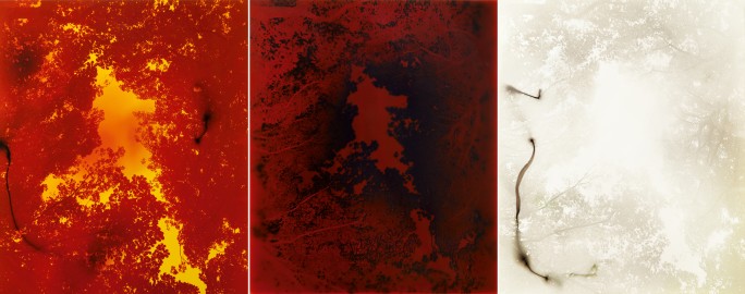
I think the reason the sea ones don’t work as well is because of the fact that they are more figurative. The marks therefore become less interesting as they are more descriptive than charged.
When painting the gouache, tracing faintly abstract shadow shapes, it feels like retracing elements of a memory that would not usually be explored or remembered. There is such an intention to detail that is usually unavailable in memory that the photograph makes available. Oddly, when engaging with this act, it distorts the memory further, autocorrecting details, creating a new memory. A layering occurs of different understanding of one moment, one interaction. The gouache facilitates a documentation of this layering affect. Each interaction with the image visible.
On the sheets, when the white gouache covers the shadow, the value nearly meets that of the light on sheets in the photograph, it brings into question which elements of the image are real, as with memory. As I trace, I loose track of what is photograph and what is painting and so retrace areas I have done, not knowing if it has already been covered. I reinvestigate a revised area thinking it represents the original. It is not about aimlessly covering but engaging with each area.
It is about being very present in the act of interaction. And the abstract quality asks the same of the viewers. The white is void of colour ? Adding/subtracting/blocking out areas that are seemingly uninteresting, bringing other areas of the image to the foreground. Going over darker areas to fade it like memory, recede to distance, white as neutral, inviting viewer to engage.
The area between each photograph is covered, merging the memories, it is unclear if they are separate events or part of the same.
Reinteracting with memory, ambiguity. Your memory can trace the shape of the event but in its own way.
And what of taking it off the wall?
Experimentation
Thinking of the memory veil I had created in the last project, I thought about incorporating the same cloth. It is fluid and ethereal like memory. I found however that it perhaps detracted from the image, it felt like an unnecessary add on and with the image of the bed, the fabric became more about the bed than the quality of memory or moment.
I also tried loose paint mark making as I had previously done but felt the gouache was something I could push further and perhaps worked better in a collection.
Since I had already created prints I tried combining the sea images with gouache again.
For the ones I had already created I removed the black from between the images which improved them a lot. Next to each other now there was more fluidity in the sense of time, it felt more oceanic. I cropped them down so there was no border which gave the image more of an immediate, interactive feel.
I created more, pairing them in twos once I’d painted on them to see what narrative and wave like feel I could achieve. Different moments of time, the jolt of a memory when something doesn’t quite match up.
There was one image of a similar size that did not work with any of the others so I cut it in half and inverted one side. Contrasting perspectives. To me, this had the effect of sea and sky.
I tried painting colour on one of the images. Intuitively choosing red as it contrasted the green blue of the image. As a monochrome colour the red worked ok but when I added blue it just looked messy. Distorting the image to this extent was too far from the original, the tension between figurative and abstraction was lost and this reduced the interest of the image I think. I had also left a slight white border which picked up the pure chroma of the paint with no ink behind it. This was ok when it was just red but looked distracting with the blue. I will try cropping it down once dry.
I particularly liked the effect of this piece, it felt dramatic with a tension between the gouache and the bare ink in spaces, it did not as obviously represent the sea but was not so abstract as to be confusing.
Overall I don’t think these are the most successful examples of what I’ve been working on. It is too difficult to remove the image from being a “landscape” and therefore the marks I make become descriptive rather then adding another dimension to the work. I feel the more successful pieces are the ones where the original image is slightly distorted in some way I have been thinking about how pieces like this could be curated in a contemporary context and how size affects the impact. I thought that upscaling the sea images would improve them however this only made the “landscape” visual clearer and therefore removed even more of the ambiguity of the image. I am looking for something more curious.
At the London Art Fair there were two artists I saw that were of interest to me.
Andrea Torres Balaguer
This artist caught my attention because of her combination of print and paint. The works felt very commercial and although I did not necessarily love the original image or the colour choice and I found the brush strokes overly simplistic, I liked the size of the pieces, the quality of the paper and the combination of mediums in a piece.
Nicolas Feldmeyer
This was my favourite piece from the show. The warmth of the image and use of light caught my attention. I liked the liminality of the moment of light in a doorway, a threshold, ironically captured permanently by photography.
Looking at his work online afterwards, I liked his use of light, a sense of moment in an image and the spaces that he cultivates or captures.
“This is not minimalism and it is not conceptual work; it is perceptual work” JT
Focused on the phenomenology of light since the 1960s, his work does not represent something but is a place of perception, the experience is the work. Considers not the symbolic elements of light but light as a substance. His work demonstrates the difficulty in distinguishing between the optical and psychological elements of light – the sensory optical experience. Light is the material but perception facilitates realization. Questions empirical certainties. The role of imagination is key to perception. Encourages reflexive seeing in his work. Turrell’s works represent mental spaces inhabited by consciousness. Typically light illuminates things, in itself it is non apparent but it makes apparent, in Turrel’s work, it is not about revealing the physical but about a revelation.
Air Mass
His work aims to be an act of visual penetration. Painting is typically two dimensions representing three dimensions. In his work Trace Elements, the opposite is true – 3D looks like 2D. It stimulates a sense of touch a sense of object but there is only light and perception. The sense of touch comes from the optical.
“I am interested in a place where the imaginative seeing and the seeing of the external world meet, where it is difficult to distinguish the seeing from within from the seeing from without-out. The image is of no interest other than it triggers the seeing from within.”
Air Mass frames the sky, making it seem like a surface, shifting perception, looking at something familiar in a different way. It is both other and right there. “The sense of colour is generated inside you.”
“My work is more about your seeing than it is about my seeing, although it is a product of my seeing”
It seems his primary interest in perception is in the science of internal image and experience. For me more about the primal and memory? I am interested in what is stimulated by an image that is seemingly objective? He frames and reframes experience?
In our last crit, my use of colour was commented on. I have long been interested in exploring colour theory, particularly since I’m so interested in perception. I went to the colour reference library with a fairly open intention to look at the psychology of colour. An afternoon is not long enough to delve into the collection but here were some initial notes and findings. (I also had a quick look through some of the artist books above. Ed Ruscha and Dieter Rot are both artists I have researched and it was interesting to see their work curated in this way).
Colour is something subjective, influenced by culture, memory, environment etc.
From the perspective of social sciences, colour can manipulate expression, feeling,experience ideas etc.
Meanings become inextricably linked with colour, colour association. White and black sometimes not classified as a “colour”. In the west black can be associated with death where white represents this meaning in China and japan. Our relationship with colour is so influenced by culture and can change. Blue used to be associated with girls and pink for boys for example, Father Christmas was blue before Coca-Cola used him for marketing.
Cohn notes that we are predisposed to like bright colours and it is culture that changes this. I wonder why that is and what is says about a culture to actively change something like that?
Colours can be descriptive, narrate an object as in representational painting, but what about the abstraction?
Perhaps the more abstract an image, the more important colour becomes because of the absence of form.
In one of our crits, Jess mentioned that one of my photographs of flowers was more interesting because it looked quite abstract and it was difficult to see what it was. This fitted in with Ramachandran’s research about how an image that wasn’t completely obvious was more intriguing to viewers since it required perceptual problem solving. Our ancestors brains evolved with a reward signal for pattern matching (when deciphering a tiger in the grass for example), and this element of the brain is still ignited when looking at an image that seems familiar and yet is not immediately obvious. I therefore decided to research some abstract photography and unclear images.
Although I do not see myself as a photographer as such, these artists explore the relationship between figurative and abstraction. They question what a photograph is, the conventions associated with it and play with materiality and the process.
Wolfgang Tillmans – Abstract photographs focus on the materiality of the photographic object and attempt to subvert traditional photographic hierarchies. “For me, the abstract picture is already objective because it’s a concrete object and represents itself… The paper on which the picture is printed is for me an object, there is no separating the picture from that which carries it. That’s why I like to show photographs sometimes framed and sometimes not, just taped to the wall.”
With a background in representational photography, he developed his abstract practice through trial and error, developing prints in dirty water, exposing them to light, scratching the surface of prints etc. His lighter series were “camerless photographs”, using photosensitive paper, light and paper to create the image. It questions our traditional notion of what constitutes a photograph and makes it an object in itself.
He also describes them as metaphysical, and in the vein of Rothko and Klein, uses the medium to promote a perhaps transcendental experience for the viewer. The viewers perception of the image changes the interaction with the object, “they are products of the mind”. They are the outcome of an interaction of human with the physical world and materiality, a collaboration rather than something completely predetermined.
He encourages the presence of the viewer when interacting with the object, “I want the pictures to be working in both directions. I accept that they speak about me, and yet at the same time, I want and expect them to function in terms of the viewer and their experience.”
Cy Twombly – His photographs appeal to me in subject matter and sentiment. He seems drawn to images of nature and the rawness that can be achieved by the imperfection of an image. There is something personal and human about the imperfection of his photographs and yet the same quality renders them quite otherworldly and alluring. Whether it is the classical subject matter or the humanness of imperfection, they feel timeless. These images “give insights into his feelings about surface, representation, poetic allusion and interplays of line and light.”
He shot the photographs with Polaroid and the printed them large to levels of distortion. He explored colour saturation, over exposure and the relationship between figuration and abstraction within photography. In some cases this resulted in images looking like a different depiction (e.g. cabbages that look like landscapes) and others were both blurred and softly in focus.
I think the way he frames the image here elevates it and it feels more like an abstract painting than an out of focus photograph.
“The photographs conjure the psychology and the aesthetic of the paintings — the paradox is that they also function, in essential ways, as opposites” (FT)
Another Magazine highlights this quote which was found on one of Twombly’s drawings from 1990 “the image cannot be dispossessed of a primordial freshness which ideas can never claim”.
Another Magazine notes the influence of Rilke on Twombly’s work, citing this quote from Letters to a Young Poet “If you will cling to Nature, to the little things that hardly anyone sees, and that can so unexpectedly become big and beyond measuring; if you have this love of inconsiderable things and seek quite simply, as one who serves, to win the confidence of what seems poor: then everything will become easier, more coherent and somehow more conciliatory for you, not in your intellect, perhaps, which lags marvelling behind, but in your inmost consciousness, waking and cognisance”.
The triptych here feels essential to the success of the images. The 3 images feels more panoramic than 1, like looking up at a wooded skyline, rather than a snapshot.
The FT article below mentions a quote from TS Eliot’s Four Quartets about memory – “footfalls echo in the memory, down the passage we did not take, towards the door we never opened”.
Matthew Brandt – describes his work as “a little bit messy and experimental”. His works are large scale and focus on the physicality of photography. He plays with the alchemy of the process, exploring different materials and ways of developing the image. Through his work he questions what a photograph is. Through his experimentation, he questions what is real and what is visualised.
In his works ‘Lakes and Reservoirs’ he photographed the lakes and reservoirs, then soaked the C-prints he created in water collected from the site. He sought out the perfect/cliched shot with the knowledge it would then be subverted, aiming to comment on the lowering waterlines of the lakes and the imminent obsolescence of c-print
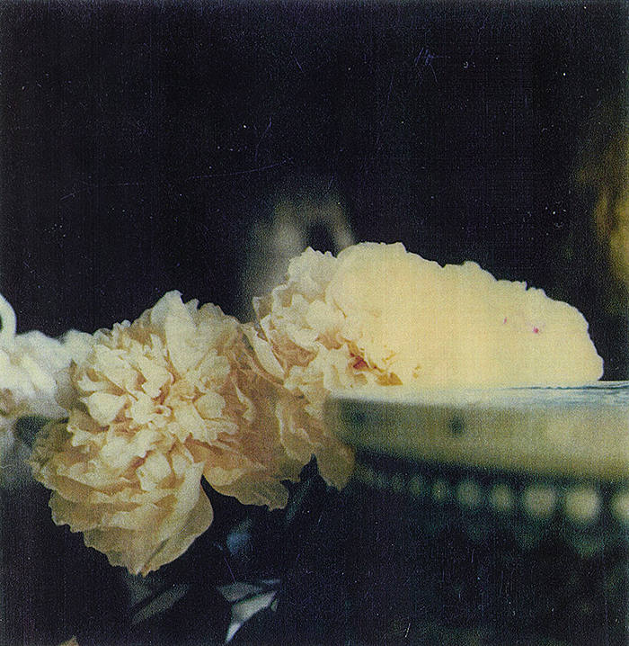
When I went to the print room, I told them I wanted to play with painting on prints so they kindly gave me a sample from the new printer to try. Although I had intended to paint onto the image, once I took it to the studio my immediate impulse was to scribble in yellow over the flowers.
Once I had printed some of my own images, I tried putting gouache on print to see what the effect would be. I painted fairly intuitively, and with Tacita Dean as an influence, and ended up blocking out fragments of the background in order to highlight elements of the fore. I chose gouache as I’d seen other artists using it on photographs, it dries quickly and can be translucent or opaque. I liked that it was fairly translucent, marks that were made were visible in later layers and it created a veiling. As a neutral colour that I’d seen other artists use, white seemed like a good choice as it is slightly affected by the colours below. I didn’t want to create just a block colour as I didn’t want it to look like just a cut out and so the texture that the gouache provided was welcome.
Though both were very different responses to the images, I was quite pleased with how they came out. Both images provoked a very different interaction, there was no uniformity in response. Perhaps this was because one image was not mine and was curated rather than found in nature. I haven’t yet articulated why I am drawn to taking images of nature but there is definitely a pattern, in London this is not as immediately available and I find myself drawn to anything organic, whether it is nature or traces of people. I think it could be the transience and movement of things.
I had also tried painting onto an image as a kind of filter. The scans is taken were imperfect, darl and grainy and j wondered what the effect would be if I altered them by hand. I applied gouache to areas that would emphasise light in the sea as a test.
Perhaps it was to do with the harshness of the black lines dividing the image but the other two images felt more impactful, more evolved, more intriguing.
In an exploration of combining painting and photography, the learnt and the primal, the cooked and the raw, I decided to try interacting with negatives.
I tried scribbling coloured pastel onto film, juxtaposing the loose mark making with the scientific process of photography. Following on from my project with the memory veils, I wanted to explore how to visually represent the subjectivity of memory. Photography feels like a good framework in which to explore this since it is seemingly objective and yet each viewer/photographer views it through their subjective lens of understanding.
I interacted with both black and white and colour film. I tried abrasives such as lemon juice and scratching to see what effects might be created. I found the lemon juice did little to nothing but the effect of the scratching left an interesting impression. I then scanned the images which resulted in an almost graffiti like impression. I worked back into some of the scanned images with analogue mark making. The process was quite cyclical, revisiting the same image at different times, providing a parallel for how our perception of an image/memory changes with time.
I used film that had fairly abstract images to experiment with, but I would like to try working with images that are more representational as well to see how this affects the impression.
I thought the colour choices were random, working intuitively, however as a stepped back to look at it on the wall, I noticed I often choose the colours red, blue and green
.
I tried placing camera film over a mirror of shattered glass I had created. Although I thought this could be interesting, I found it difficult to articulate what this composition said and I felt there would be more places to go with painting on the film and photographs.